© Copyright – 2026 – Athletics Illustrated
Athletics Illustrated Magazine logo and emblem are sporting a new, more sophisticated look.
After more than 16 years with the Helvetica-like font and a male steeplechaser climbing the “a” and landing on the “h,” it was time. It was time to move forward from the 2000s era vector-like image. Moving toward something that implies the sport of athletics, rather than literally focusing on the steeplechase.
The steeplechase event is still amazing. That will never change. But the image is narrowly focused on track (stadia) and steepling or perhaps hurdling. Athletics is a broad sport with various events, including racewalking, wheelchair racing, sprinting, middle-distance running, and long-distance running. There is track, cross country, road, trail, mountain and fell running. There are jumps, throws, and hurling events.
The new image suggests a runner. The runner could be either gender. And the athlete could be competing in one of many athletics events, javelin, middle-distance, long-distance, or even the sprints.
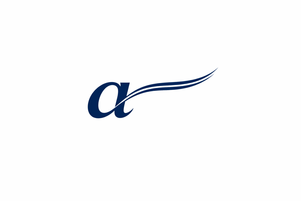
The emblem to the left of the new Athletics Illustrated wordmark displays as a stylized, abstract running mark. Perhaps a hybrid of several visual ideas working together:
Forward motion/speed lines, the sweeping diagonal strokes create the feeling of acceleration and momentum, similar to motion blur.
Wing motif: the layered shapes resemble a wing or feather, which subtly evokes lightness, flight, and athletic grace.
Track-and-field energy: the sharp curves and tapering forms feel kinetic, almost like a runner leaning into stride.
Calligraphic “A” influence: the mark loosely suggests the letter “A.” It does this without becoming a literal monogram, helping tie it back to Athletics.
Editorial sophistication: unlike many sports logos that are heavy or aggressive, this emblem uses thin, elegant strokes. It is more akin to publishing or magazine branding.
From a branding perspective, you could describe it as: “An abstract winged motion emblem combining speed lines and calligraphic forms to evoke running, momentum, and editorial elegance.”
Or more succinctly: “A stylized kinetic wing mark.”
It carries a contemporary sports-media aesthetic. It is somewhat reminiscent of enduring athletics federation marks. Also, newspaper-era sports logos, yet refined into a compact editorial identity.
The winged “a”
Much of the feedback from crowdsourcing was clear. People said, “DO NOT use the letters “ai” as an emblem associated with the brand Athletics Illustrated.” Sadly, those are the initials. While Sports Illustrated uses SI and Runner’s World uses RW, Athletics Illustrated must use one letter. Whereas AIM for Athletics Illustrated Magazine was not going to work.
On the other hand, The Athletic uses a single letter, the stylized “A” and social media platform Pinterest uses “P.”
So, we settled for the single letter “a.” Saying that, it looks good with the quill.
The lines coming off the back of the stylized “a” above imply a writing quill. It also evokes a nod toward the Greek Wings of Mercury and a signature pen stroke. If one must commit, those two lines are a stylized quill.
The navy blue
The dominant navy colour in the logo is approximately:
RGB: 1, 36, 88
HEX: #012458
Approximate print conversion:
CMYK: 99, 59, 0, 65
#012458 is the primary core navy used in the mark.
Navy blue is a very dark shade of blue that symbolizes authority, trust, professionalism, and stability. The colour was used in the 18th-century British Royal Navy uniforms. It represents discipline and tradition, offering a sophisticated, calm, and reliable alternative to black in fashion and corporate branding.
Font style
New typography direction on Athletics Illustrated Magazine is a style that appears to fit into the modern “editorial serif” category, which is sophisticated, high-contrast, magazine-inspired typography similar to:
Adobe Fonts families like Canela, Fenway Banner, or Noe Display, contemporary luxury/editorial serifs such as Instrument Serif or Cheltenham, classic newspaper/book-inspired serifs with modern spacing and lighter weight contrast.
It is Cheltenham.
The overall feeling attempts to be:
Sophisticated
Literary/editorial
Intelligent rather than sporty
More “The Atlantic/New Yorker/Financial Times culture section” than traditional athletics branding
This aligns with a broader industry shift back toward elegant serif typography in publishing and media branding. And the evolution of Athletics Illustrated Magazine to more sophisticated writing.
You could say: “Transitional Serif that is refined, readable, and editorial. A Modern/Didone Serif, high contrast, luxury feel.
Use of a modern editorial Serif, which is softer, warmer, and modernized classic serif.
Visually, it no longer appears to be a slab serif athletics font, and is closer to a traditional newspaper Times-style serifs. To borrow a phrase, what is old is new again. When Athletics Illustrated began in 2010 and had partnerships with MileSplit and various editors, the stories were less urbane and lacking precision.
Things have changed. Welcome to the new cosmopolitan yet erudite era.


